Brand Elements
Brand Elements
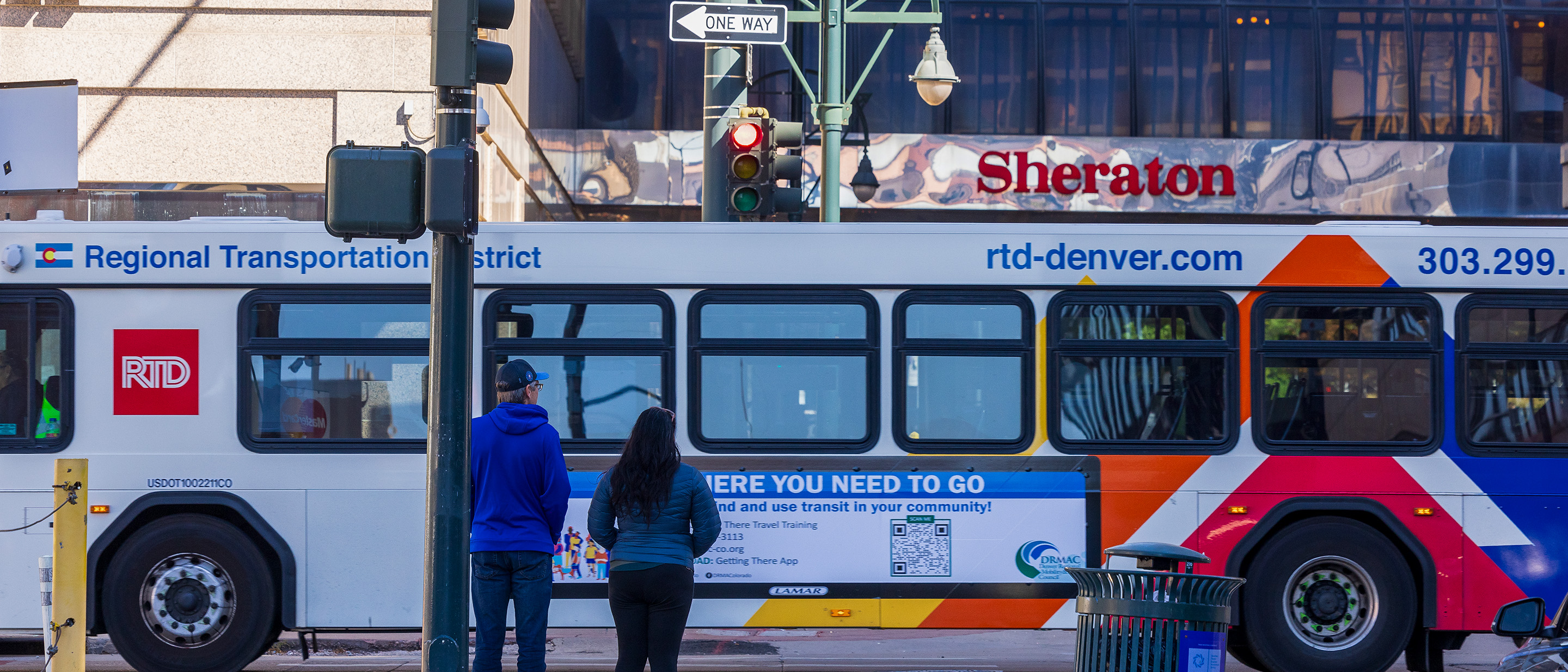
The RTD brand is about so much more than just the logo. It is the visual and verbal expression of who we are as an organization, why we exist, and the promise we make to our customers every single day. Through carefully chosen words, images, and service offerings, we communicate the value we provide, as well as our unyielding commitment to the people we serve. Our brand signifies and influences everything we do as an agency.
Download RTD's BrandbookColors

Primary
Color is an integral part of the RTD visual identity system. Consistently applied color further cements the brand and creates instant recognition within the marketplace among a wide array of customers.
- RTD Red: #CE0E2D
- RTD Blue: #002F87

Secondary
Each primary color is expanded into a "family" of secondary colors. These are to be used as accent colors only. They can differentiate products, denote an instance within a series, create diversity within a "mono color" composition, or draw the viewer's eye with a spot of contrast.
- RTD Orange: #F6871F
- RTD Gold: #FDBA2F
- RTD Mid Blue: #41C1EF
- RTD Dark Red: #852E2C
- RTD Teal: #009483
Rail Colors
In addition to the primary and secondary “family” of colors, we use a set of tertiary colors exclusively for designating specific rail lines. Tertiary colors identify all corresponding assets as belonging to a specific rail line.
- A-Line: #54C0E8
- B-Line: #4C9C2E
- D-Line: #047835
- E-Line: #691F74
- Flatiron Flyer: #003595
- G-Line: #F4B223
- H-Line: #0055B8
- L-Line: #FFCD00
- N-Line: #904199
- R-Line: #C1D32F
- W-Line: #0091B3
Typography
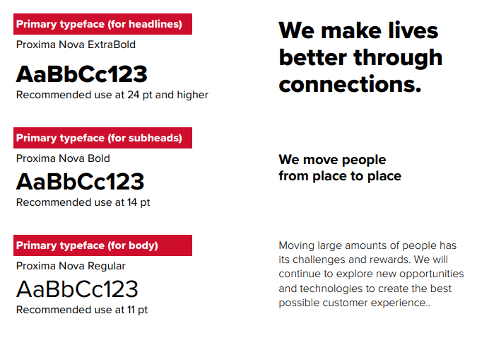
RTD’s standard corporate typeface is Proxima Nova. The font is easy to read, understated, straightforward and friendly. It unifies our brand in all Marketing and Communications materials, internally and externally. The PC equivalent to Proxima Nova is Tahoma, which is approved for use across the agency and does not require additional licensing.
RTD recommends secondary fonts be used sparingly and only in particular applications. This helps add a bit of embellishment to things such as social media posts or posters. Limit the use of secondary fonts in order to avoid confusing/overwhelming the reader.
Voice
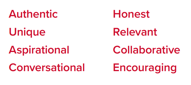
As the "People Who Move People," RTD must communicate with our communities in a manner that is both humanized and relatable, and that creates a positive, consistent experience with each interaction across our agency. The "voice" of the agency is projected in all spoken, written, and visual communications. Following are some characteristics of the RTD brand voice.
- Authentic
- Unique
- Aspirational
- Conversational
- Honest
- Relevant
- Collaborative
- Encouraging